How responsive display ads replace fixed banners
In Google Ads, a responsive display ad is a set of parts: landscape and square images, a logo, a few headlines and descriptions. Google combines them to fit the ad slot on each site and app, including the classic banner shapes. Performance Max campaigns use your image assets the same way.
So one good landscape image and one good square image can appear as a rectangle on one site and a wide banner on another, without you designing each size.
What StoreToAds delivers
| File | Size | Use it for |
|---|---|---|
| Landscape | 1.91:1, 1200x628 | Landscape image in responsive display ads and Performance Max |
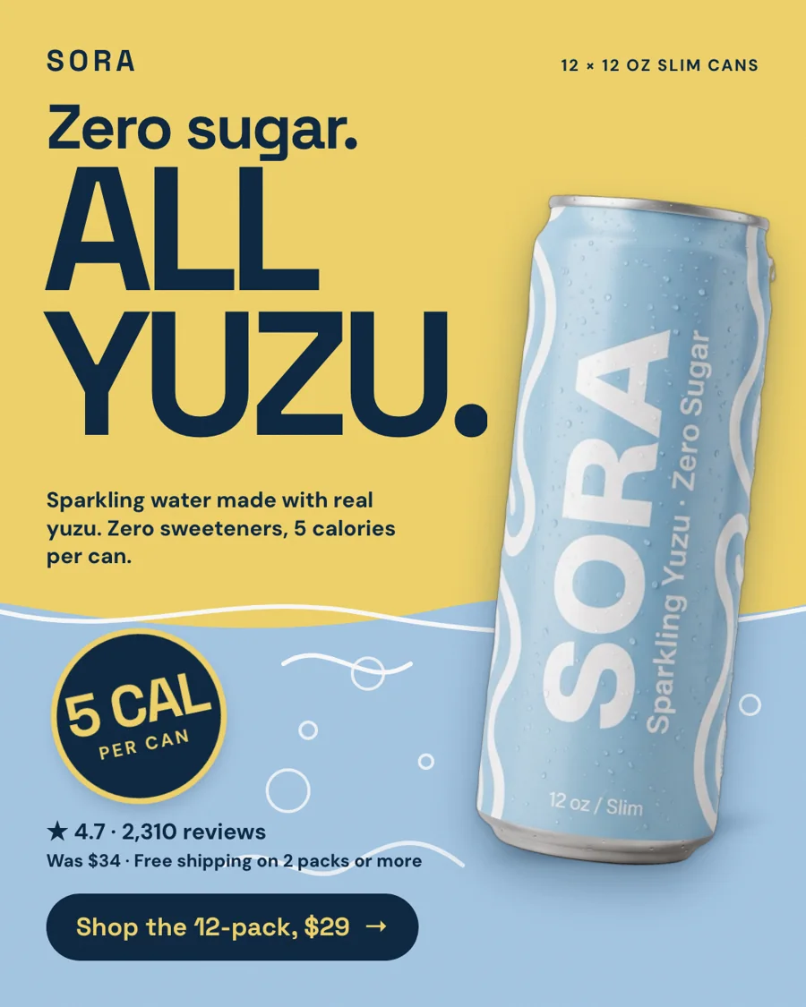
| Square | 1:1, 1080x1080 | Square image in Google campaigns (Google's minimum is 300x300) and Meta |
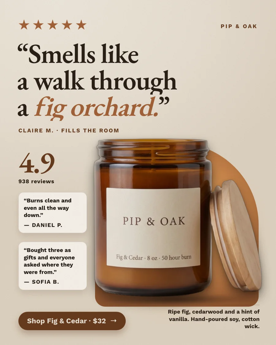
| Portrait | 4:5, 1080x1350 | Portrait images in Performance Max, and Meta feeds |
| Tall | 9:16 and 2:3 | Stories, Reels and Pinterest |
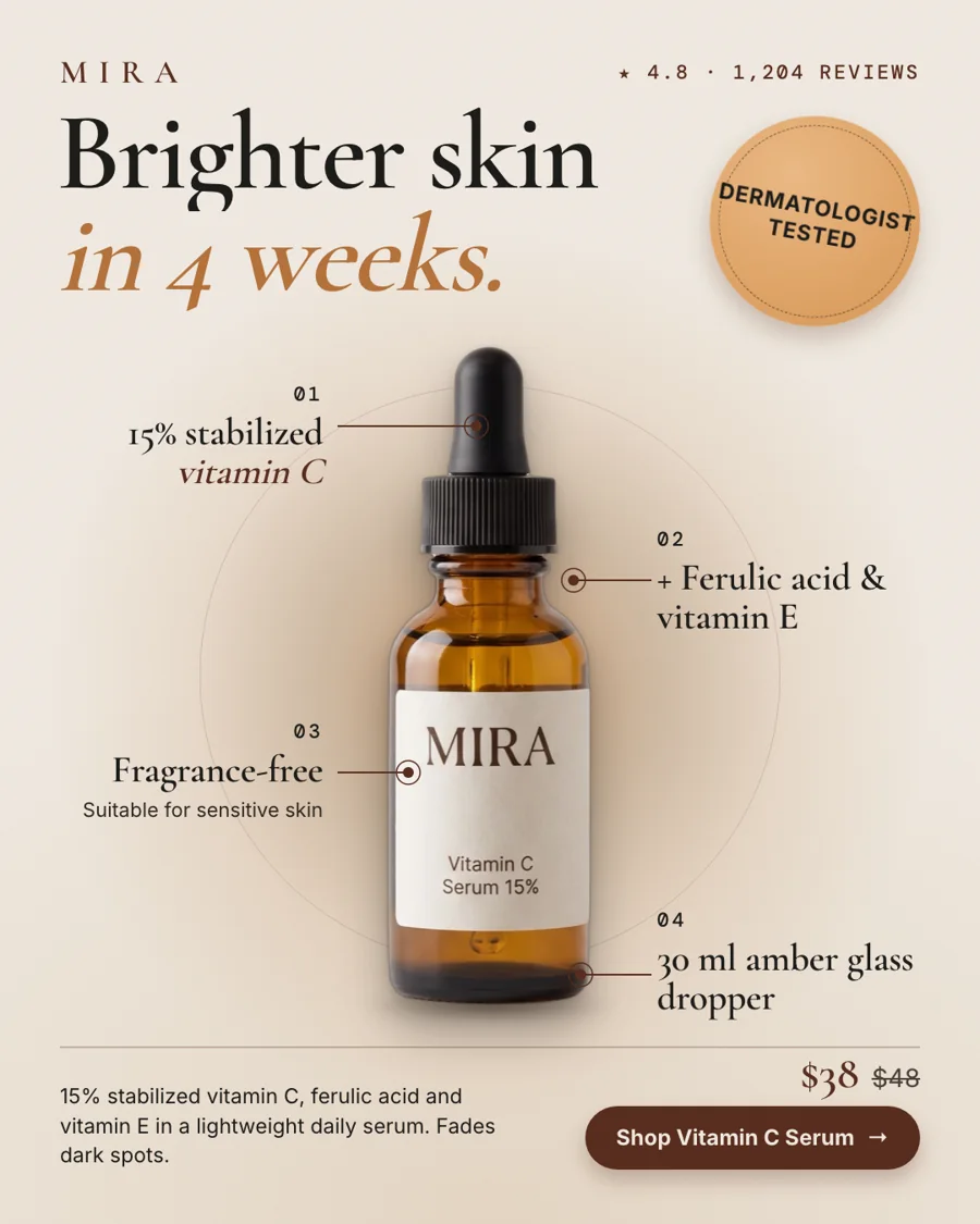
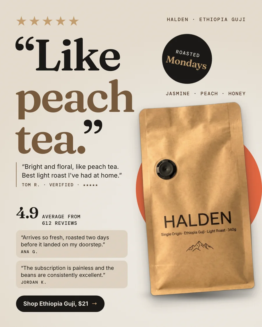
Every file is a static PNG with your real product and checked prices and reviews. You upload them to Google Ads yourself; StoreToAds doesn't connect to Google.
Honest note: fixed-size banners (300x250, 336x280, 728x90, 300x600, 320x50, 970x250) and HTML5 banners aren't offered yet. If your ad network or media plan requires exact sizes, you'll need another tool for those.
Picking images for display
Google's guidance favors images with little text on them, since its layouts add your headlines separately. Choose the calmer, product-led ads from a batch for Google, keep the product clear of the edges so automatic cropping doesn't cut it, and check Google's current image policies before you upload. Our Google display sizes guide has the full list.