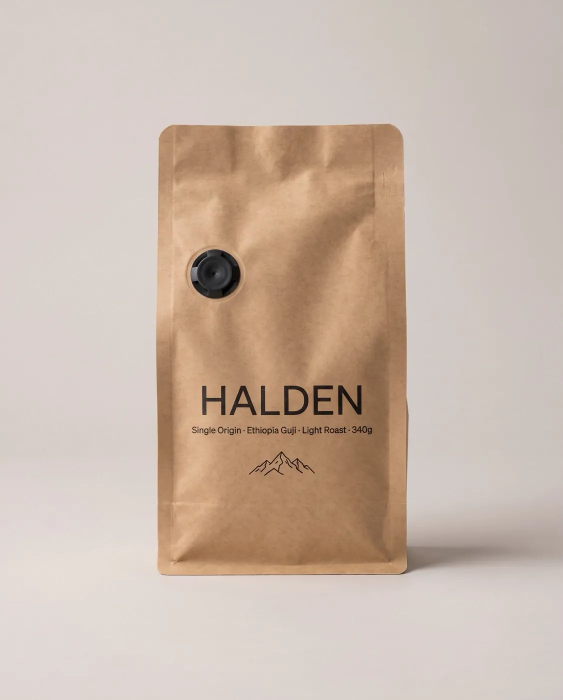
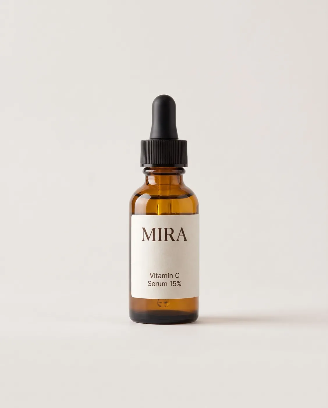
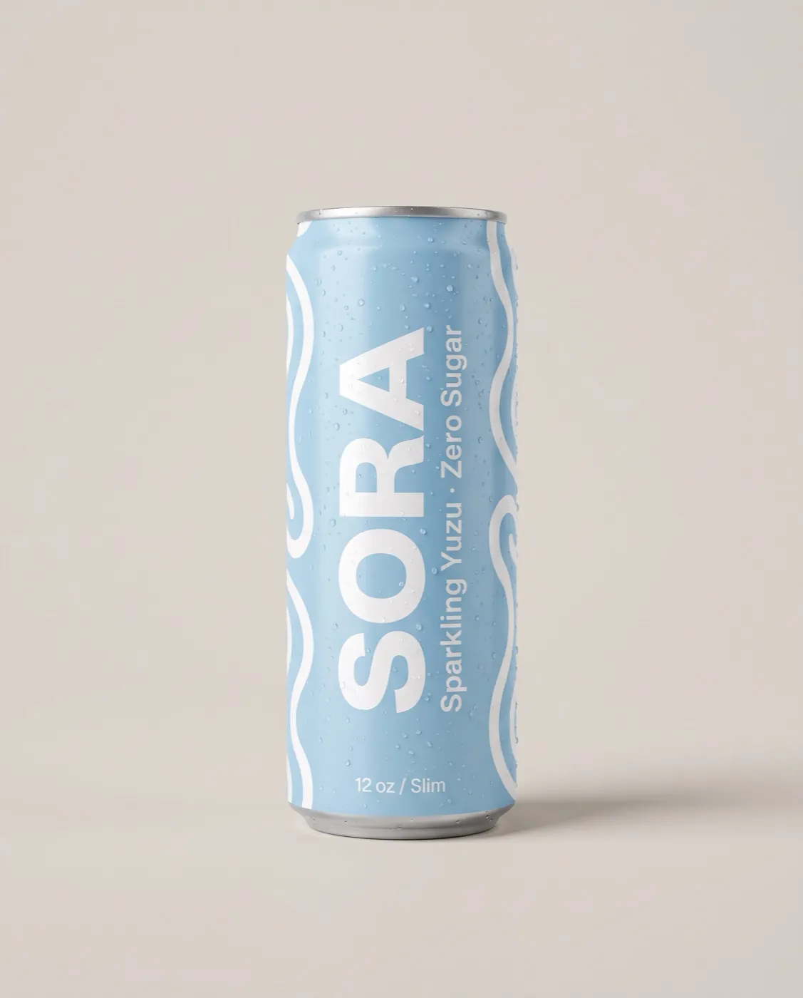
Where a square runs on Meta
| Placement | Meta's recommended minimum | Our 1080 x 1080 square |
|---|---|---|
| Facebook Feed (1:1) | 1080 x 1080 | Meets it |
| Instagram Feed | 1080 x 1080 | Meets it |
| Facebook right column, Marketplace | 1200 x 1200 | Under the recommendation |
| Messenger inbox | 1200 x 1200 | Under the recommendation |
Carousel cards are square too, so a few square ads can become a carousel in Ads Manager.
Composing for a square
A square has no spare height, so the layout decides what wins. Two patterns work well:
- Stacked: headline on top, product in the middle, price and button at the bottom. Clear and familiar.
- Side by side: product on one half, headline and proof on the other. Good for review quotes and spec callouts.
Whatever the layout, check the ad at thumbnail size. The right column and Marketplace show squares small, so one big number or a short headline survives where a paragraph does not.

How we make the square
Every ad is designed and checked at 4:5 first. The square then shows that full design at 80% scale in the center, with 108 px side bands made from the ad's own background edges, or a soft blur when the background is a photo. Because nothing is re-flowed, a square never puts text over the product.