The Instagram square, in numbers
| Instagram square | |
|---|---|
| Size | 1080 x 1080 px |
| Ratio | 1:1 |
| Where it shows | Instagram feed, carousel cards, Facebook feed |
| Meta's recommended minimum | 1080 x 1080 px for Instagram Feed images |
| Keep clear | The bottom and side edges, as Meta asks for 1:1 and 4:5 Instagram Feed ads |
A square is a fifth shorter than a 4:5 ad of the same width, so it gives up some feed space. What you get back is one shape that sits cleanly between organic posts and slots into a carousel without cropping.
What makes a square stop the scroll
- Center the product. A square has no spare height for a separate headline band, so the product and the headline share the middle of the frame.
- Keep one message. On a phone a square is only a few inches wide: a headline of up to eight words and a price is about all that stays readable.
- Keep text off the bottom and side edges, where Meta asks you to leave room on Instagram Feed ads.
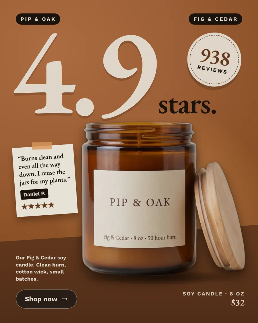
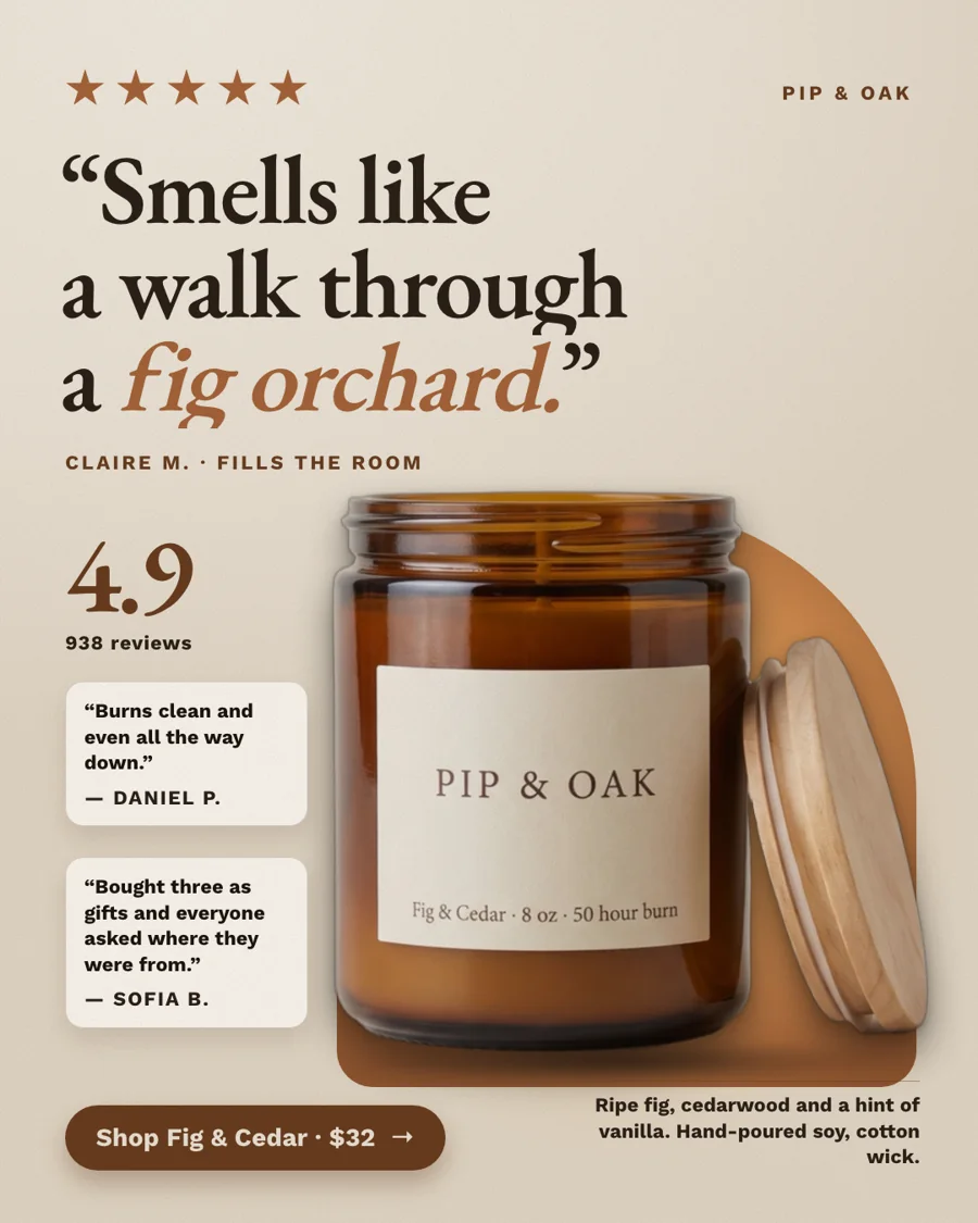
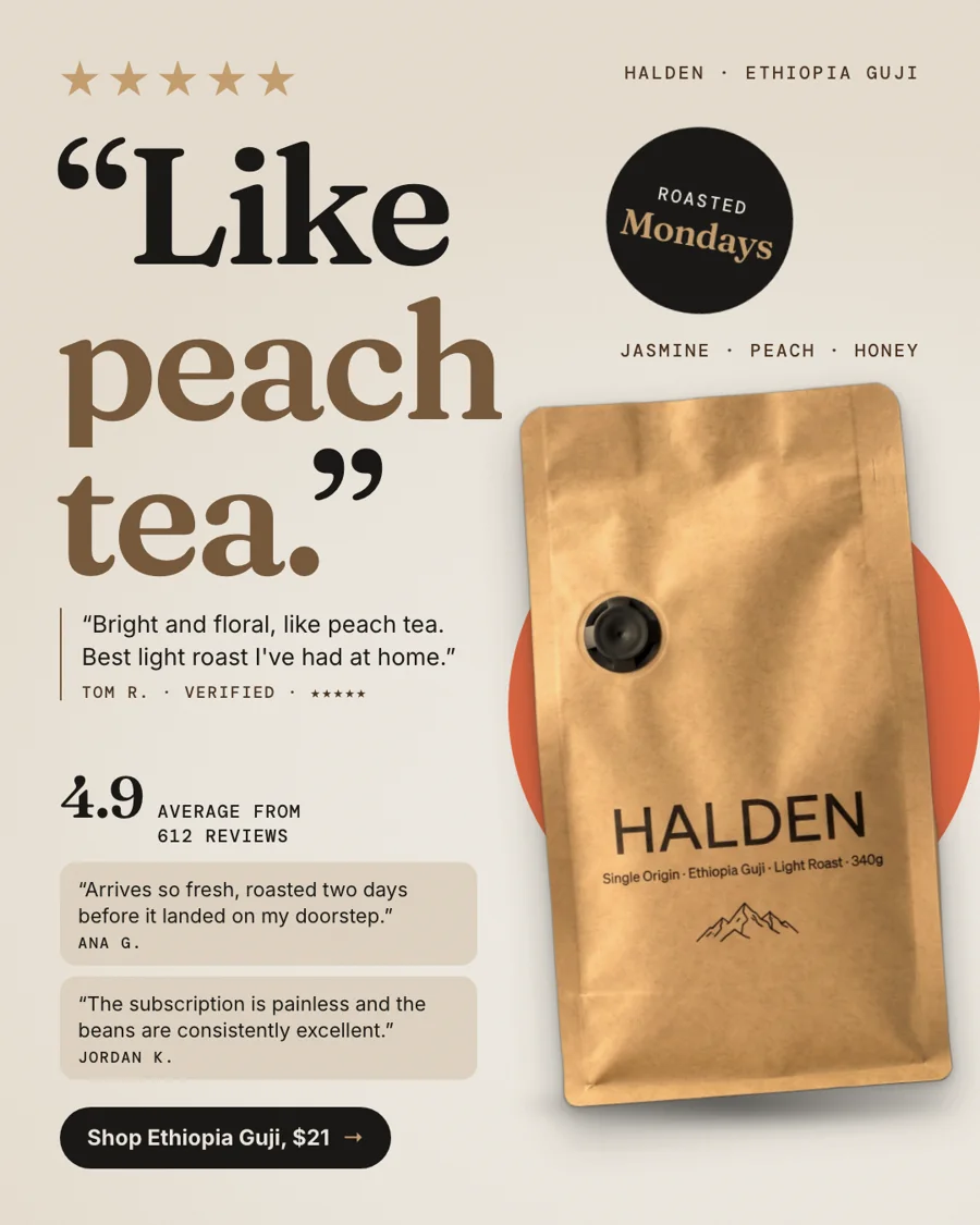
- Make it look like a post, not a banner: one strong photo, a calm background and type that matches your brand. Formats like a review card or a Notes-app list blend into the feed well.
How our square is made
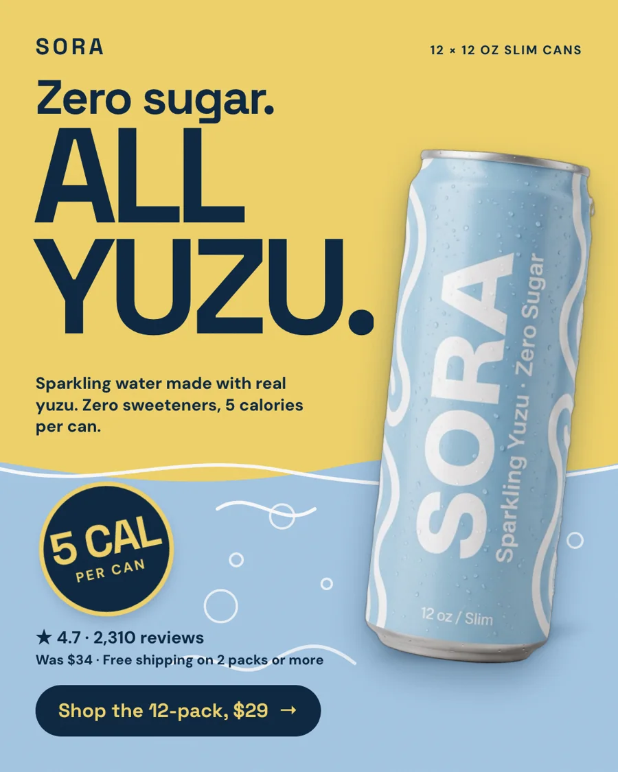
StoreToAds designs and checks every ad at 4:5 first, then places that same design on the 1080 x 1080 canvas: the full ad at full height in the center, with 108 px bands on each side that continue the ad's own background. Nothing is re-flowed, so the headline never ends up on top of the product.