minimal product ad generator

Minimal product ads: one product, one line, nothing else

A minimal ad is the hardest kind to make look good, because nothing hides a weak photo or a vague line. StoreToAds builds clean, product-first ads from your real photo, with one short headline and a clear price or call to action.

Launching soon. Early access opens in small batches; we'll email you first.

Minimal is a style, not a price point

Minimal works for a $12 bar of soap and for $400 headphones. It is not the same as luxury: luxury is about desire, minimal is about removing everything that is not the product. Reach for it when the design of the product is the selling point, when you retarget people who already know you, or when you need one calm ad to stand out in a feed full of loud ones.

The rules of a minimal ad

  • One headline, ideally six words or fewer.
  • The product large, sharp and well lit, with a soft shadow so it sits on the surface.
  • One accent color from your brand, used once.
  • A price or a call to action, set small and confident.
  • No badges, no second quote, no feature list.
  • In 9:16 story sizes, keep text out of the top and bottom strips where the app's own buttons sit.

Copy for very little space

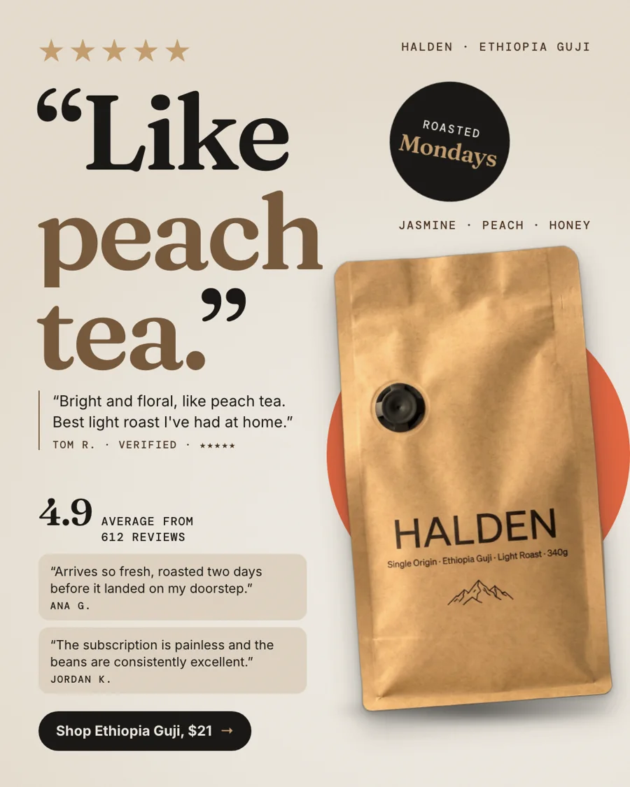
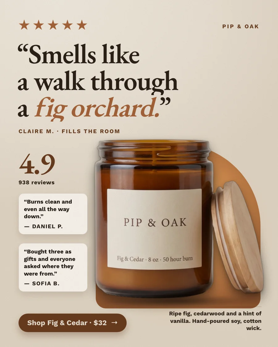
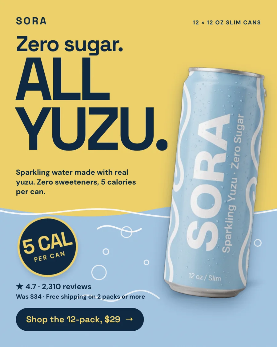
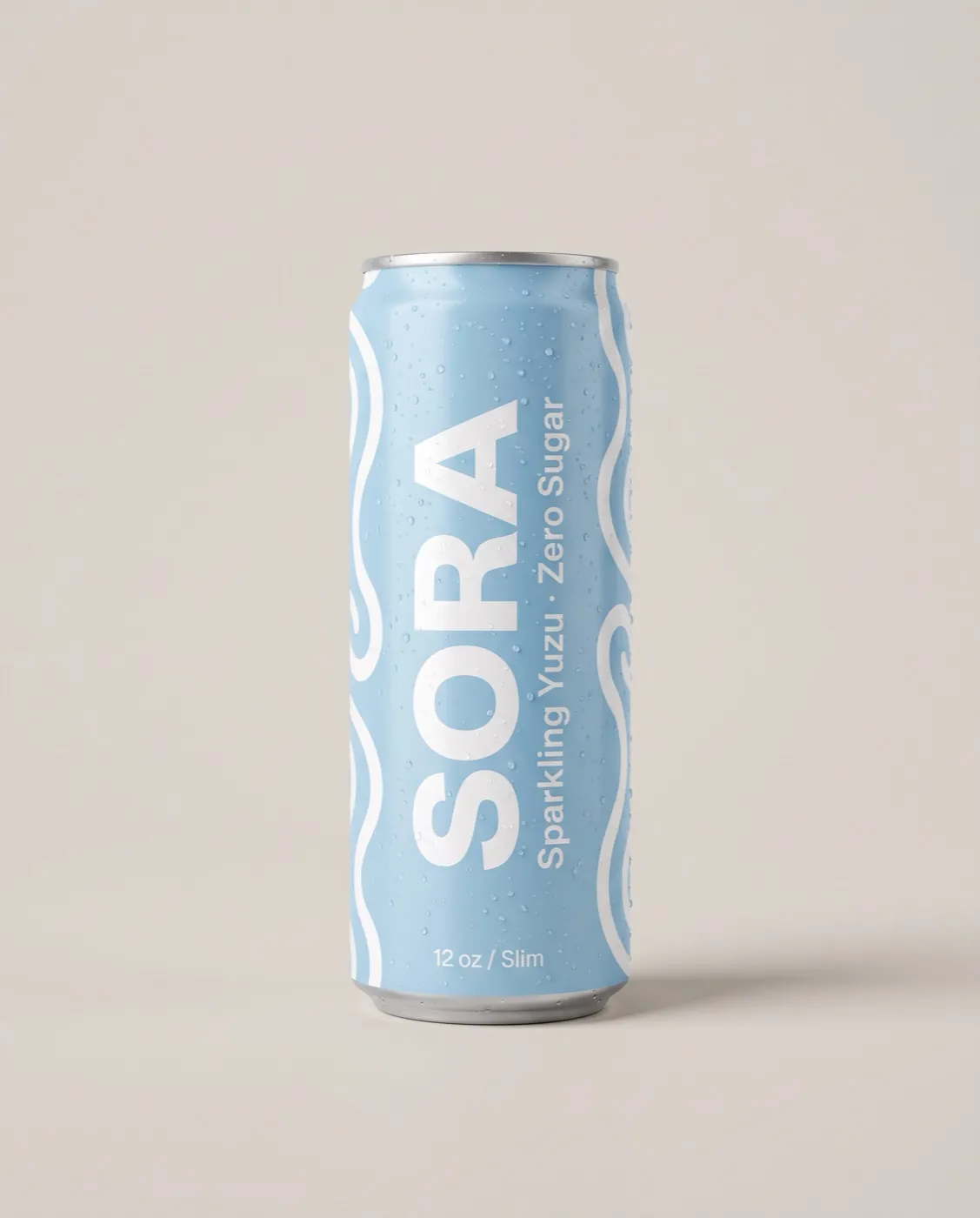
Short lines carry the whole message, so each word has to be specific. Our fictional sample brands show the idea: "50 hours of fig and cedar." for a candle, "Zero sugar. All yuzu." for a sparkling drink. Generic examples that work the same way: "The tote. In sand." "Two ingredients. That's it." "Built for one cup."

In a batch, a minimal ad also works as a control. Run it next to your strongest review ad, and you will see whether your audience buys the product or the proof.
How it works

How StoreToAds makes it

  1. 01

    Start with a clean photo

    Paste your store; we cut out your real product photo. A sharp, evenly lit packshot makes the biggest difference in a minimal ad.

  2. 02

    Ask for it in Your brief

    Choose the minimal and light looks, and skip busy formats such as quote walls or chat screenshots.

  3. 03

    Fewer words, all checked

    The price and any claim in the line are checked against your store before delivery.

  4. 04

    Space kept in every size

    The 4:5 design is checked first, then placed in 1:1, 9:16, 2:3 and 1.91:1 with the same breathing room.

Examples

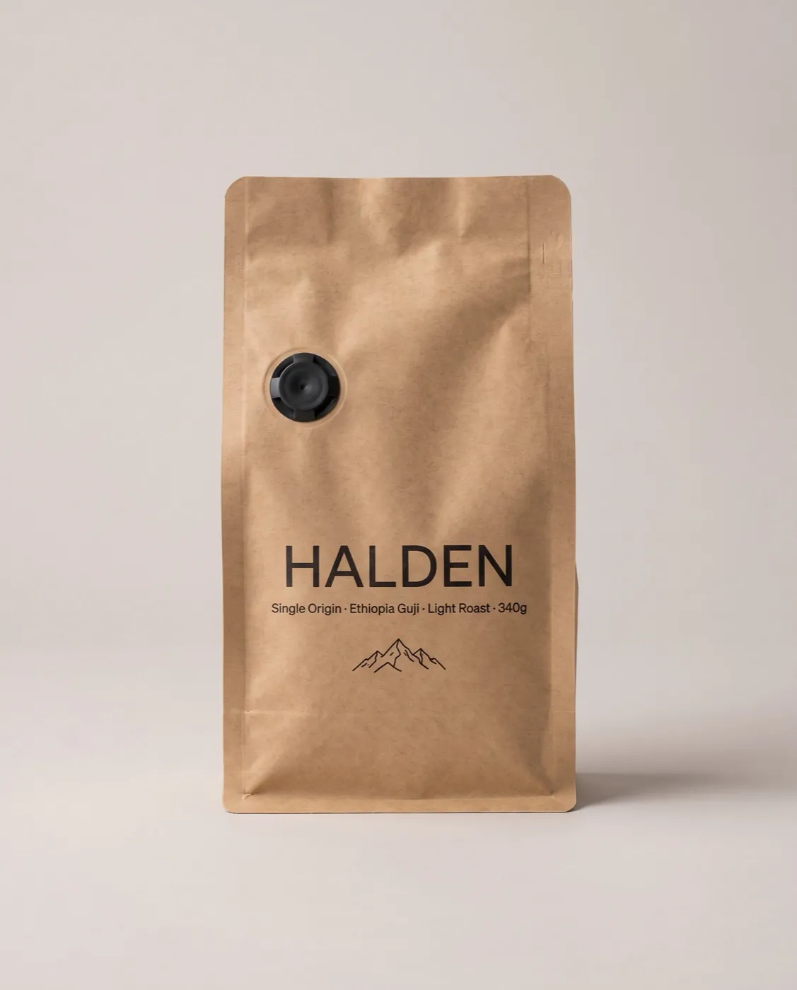
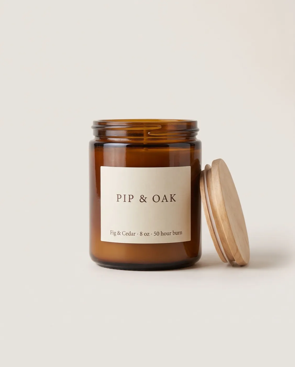
Fictional sample brands. Drag across an ad to see the store photo it was made from; our engine designed each one from that photo and the store's data.

Sample stores
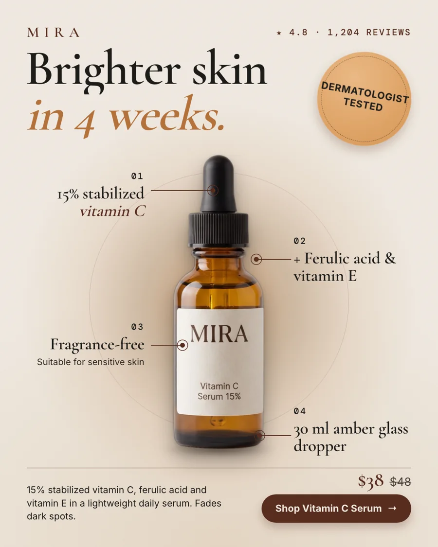
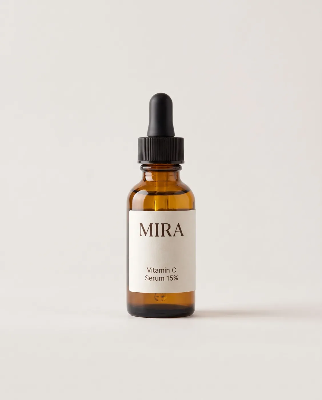
The finished Mira ad: BenefitMira Vitamin C Serum 15%: the product photo from the store

Mira

Skincare

Vitamin C Serum 15%

  • Price checked
  • Reviews checked
  • 5 sizes

Reason to buy: Benefit

Make this for my store

Questions

If I choose minimal, will every ad look the same?

No. A batch keeps variety within the looks you choose: different photos, layouts, type and background tones.

Does it need a white background?

No. Light neutrals, your brand color or a dark tone all work, as long as there is one background and nothing else.

Do minimal ads convert?

Sometimes better, sometimes worse than busy ones. It depends on your product and audience, which is why it is worth testing against your other angles.