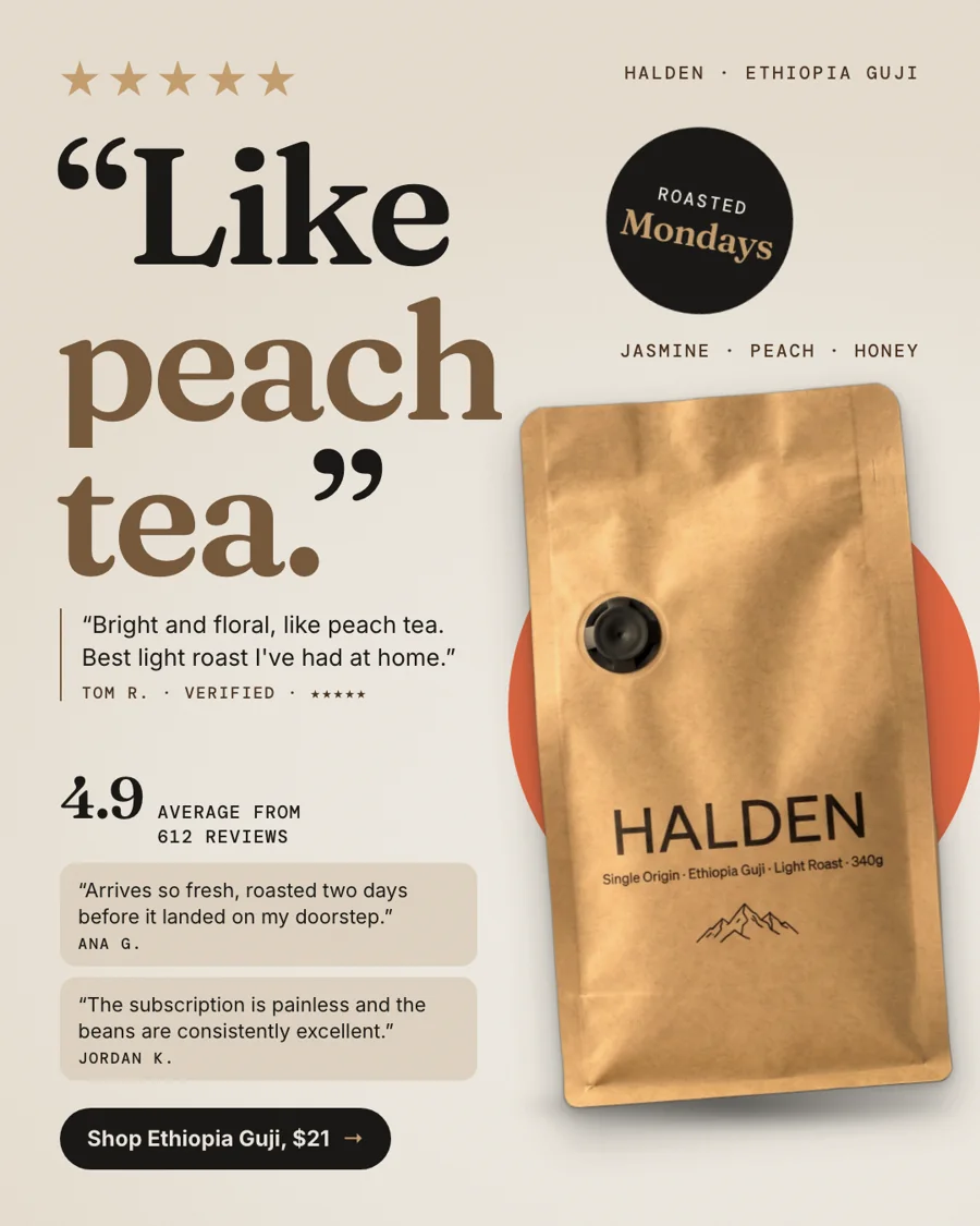
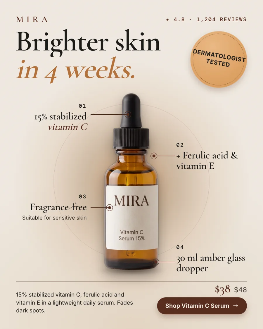
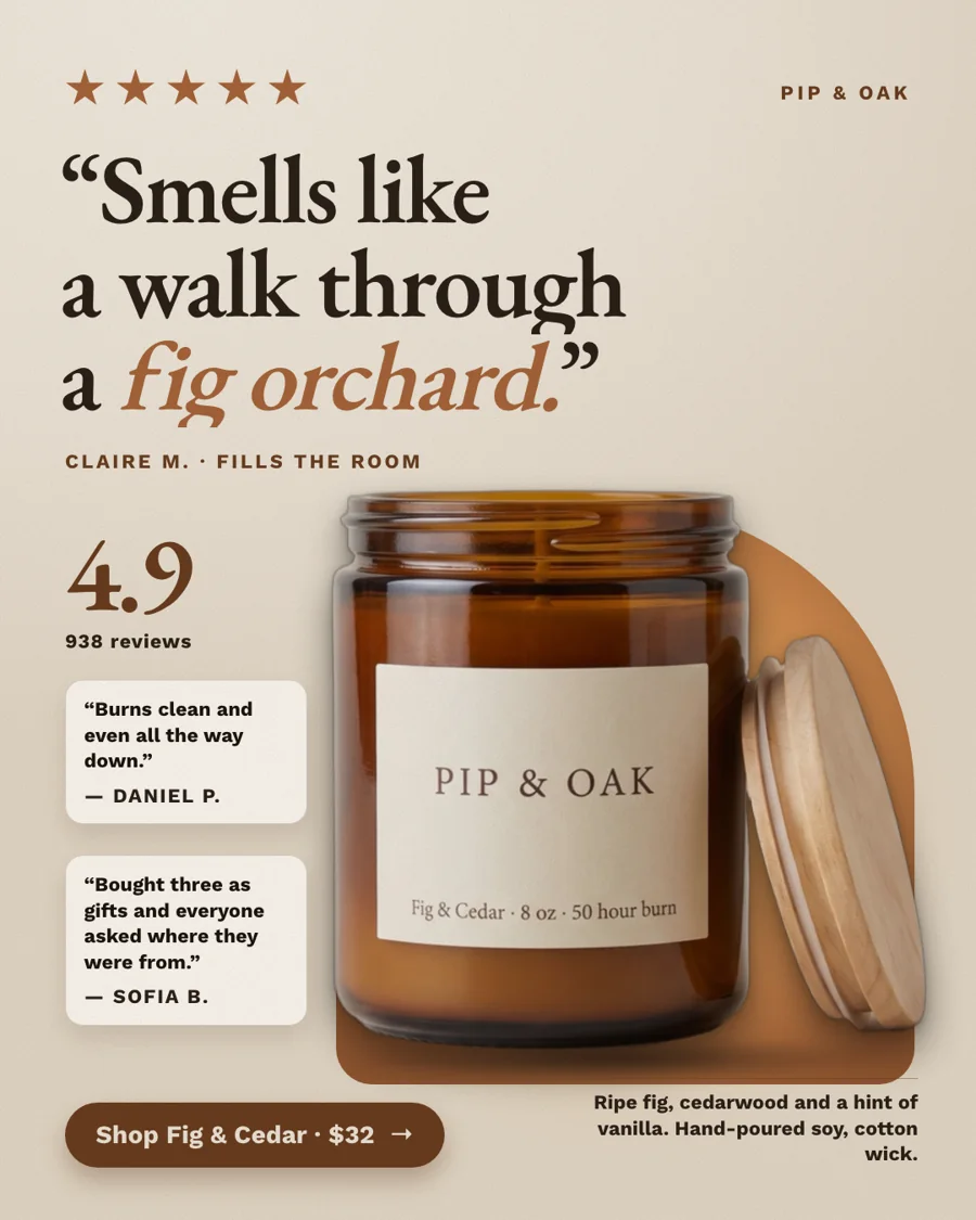
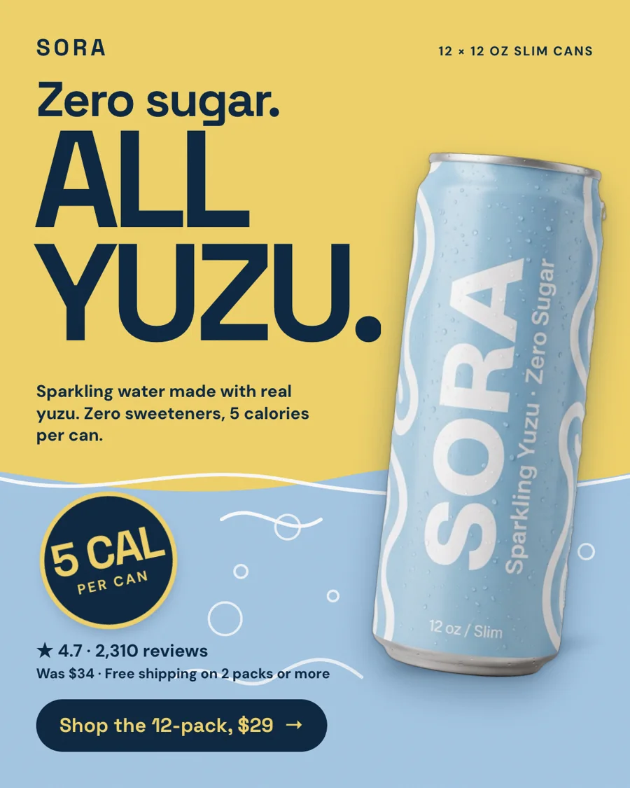
Anatomy of a Facebook feed ad
| Part | What it does | What to aim for |
|---|---|---|
| Hook headline | Stops the scroll | About 8 words or fewer, readable at thumbnail size |
| Product | Shows what they'd buy | Big and sharp, label readable, a third to 60% of the frame |
| Proof | Makes it believable | A star rating, a review count or one real quote |
| Price or offer | Qualifies the click | Only if it's true on your product page today |
| Call to action | Says what to do next | A short verb phrase: Shop the serum, Get 12 for $29 |
Around the image, Meta shows your primary text, a headline and a button. Keep the primary text short, since long text gets cut behind a See more link, and let the image carry the main idea.
The size to start with
Use 4:5 (1080x1350) for the Facebook and Instagram feeds: it fills more of a phone screen than a square. StoreToAds designs every ad at 4:5 first and checks it there, then delivers 1:1, 9:16, 2:3 and 1.91:1 versions of the same design. See Facebook feed ad specs for the details.
Common Facebook ad mistakes
- Text covering the product. Our layout checks reject it.
- Three messages in one ad. Split them into three ads and let Meta find the one that works.
- A discount that isn't live. Shoppers click, see a different price and leave.
- Tiny type. Anything under about 22 px on a 1080 px canvas disappears on a phone.