What makes a poster ad work
A poster is the opposite of a product page. It has one job: make someone stop and read three to six words. Everything else is support.
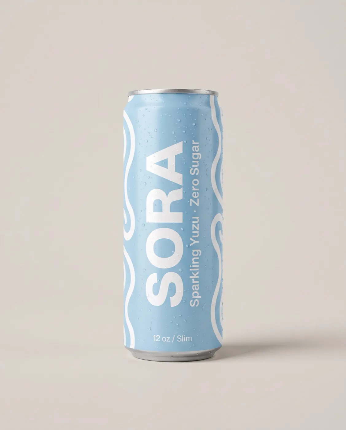
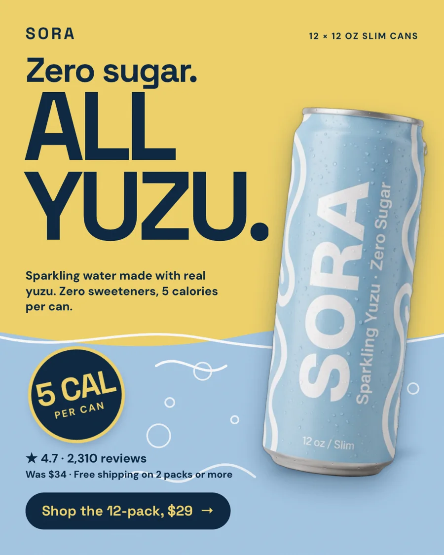
- One headline, short enough to set huge. "Zero sugar. All yuzu." works because four words fill the frame.
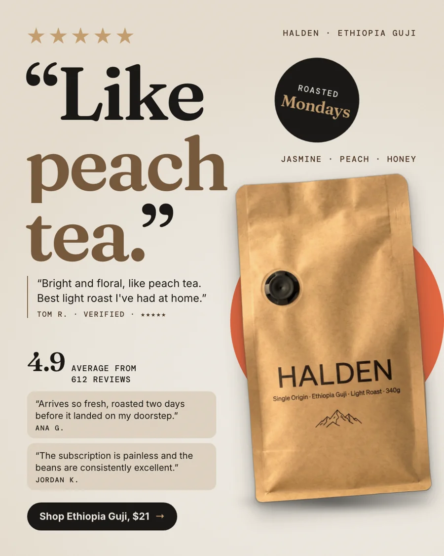
- Color blocking instead of a scene. Two or three flat brand colors give the product contrast without a busy background.
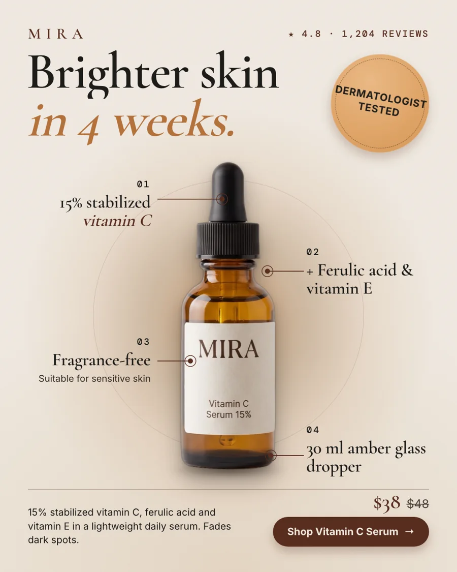
- A sticker for the proof. A rating, a calorie count or a sale price in a round badge reads in a glance.
- The product breaking the grid. Overlapping a color edge or tilting slightly makes a still image feel like it moves.
Poster or something calmer?
Poster ads suit products with a clear, punchy claim and brands with some personality: drinks, snacks, gadgets, apparel. Quiet luxury brands usually do better with editorial layouts. StoreToAds sets a loudness level from your store's own look and mixes formats in every batch, so you can see which style your buyers respond to.
Want more posters? Set the look to bold in Your brief. Want fewer? Choose minimal or editorial.
Poster mistakes to avoid
- Two headlines fighting for attention. Pick one and put the second idea in another ad.
- Text over the product. Our layout checks reject designs where words cover it.
- A discount badge with no real discount behind it. Price-drop badges only appear when your store shows a compare-at price or you set an offer in Your brief.