What reads as luxury in a static ad
- Space. The product gets room to breathe, with nothing crowding the frame.
- One line of copy, often under five words: "Made to be kept." "Fewer, better things."
- Refined type: an editorial serif or a fine sans, never a loud condensed headline.
- A dark or warm neutral palette that suits the material.
- Detail you can verify: the leather, the stone, the origin, the hand-finishing, but only when your product page states it.
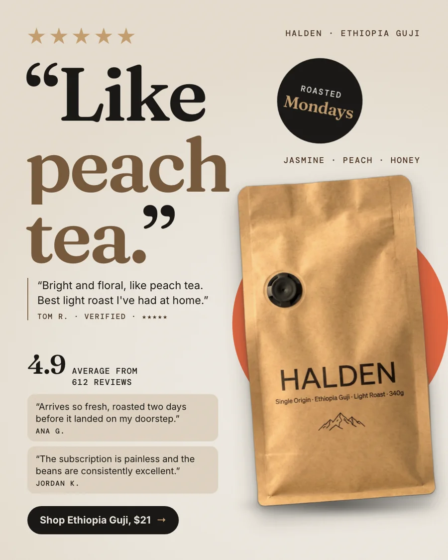
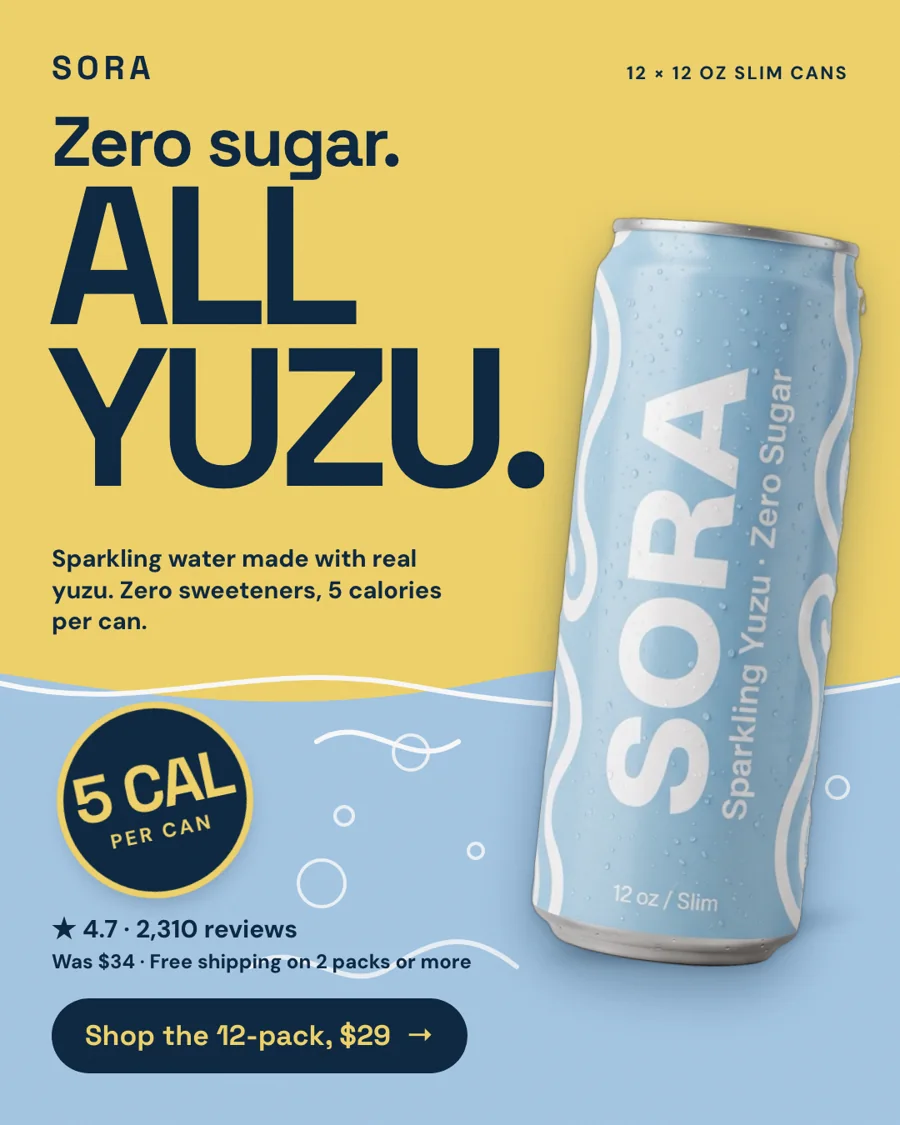
- No stickers, no percentages, no "shop now" shouting.
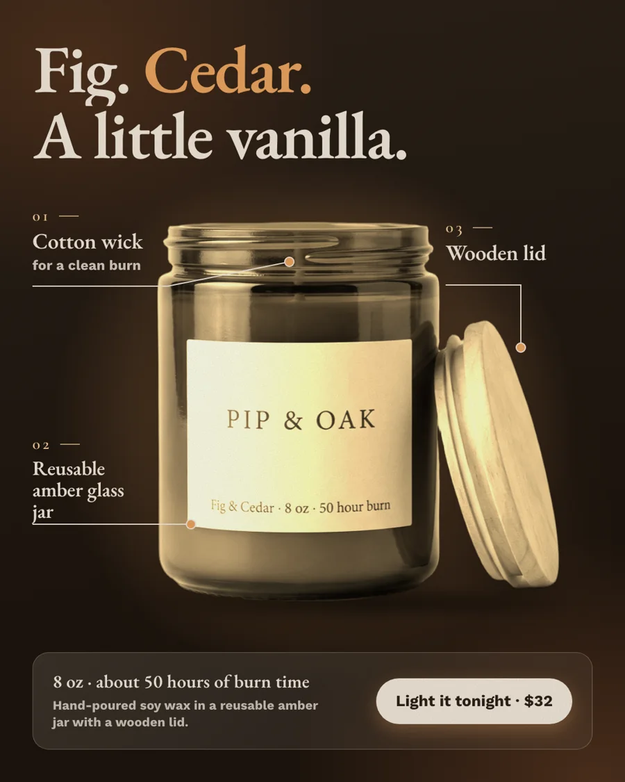
Show the price or leave it out?
Many luxury houses leave the price out of the ad. For an online store, showing it can help, because it filters out people who were never going to buy and the clicks you pay for get better. There is no rule here, so test both: one version with the price set small and calm, one without.
Mistakes that make expensive things look cheap
- Borrowed luxury words you cannot support: "rare", "handcrafted", "heritage".
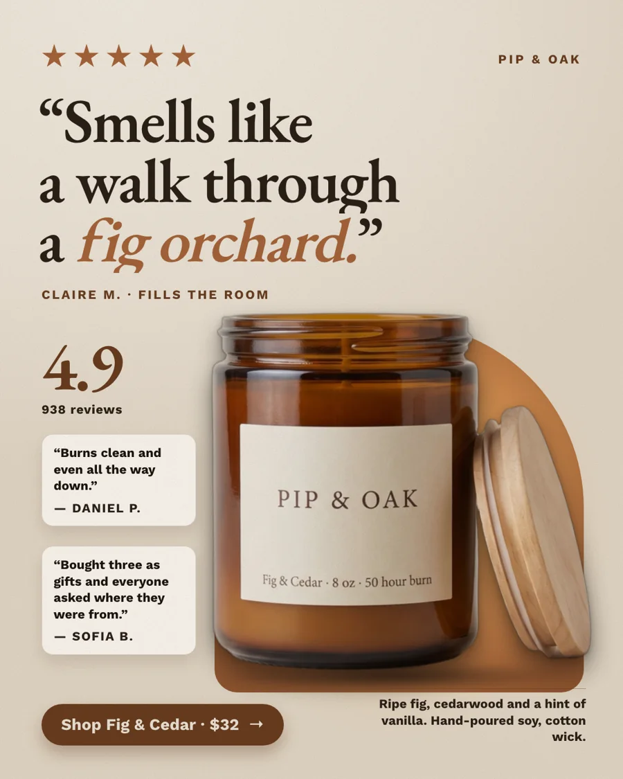
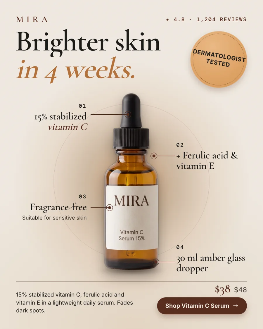
- Urgency and discount language next to a $900 product.
- Five claims fighting for attention. Luxury ads make one point.
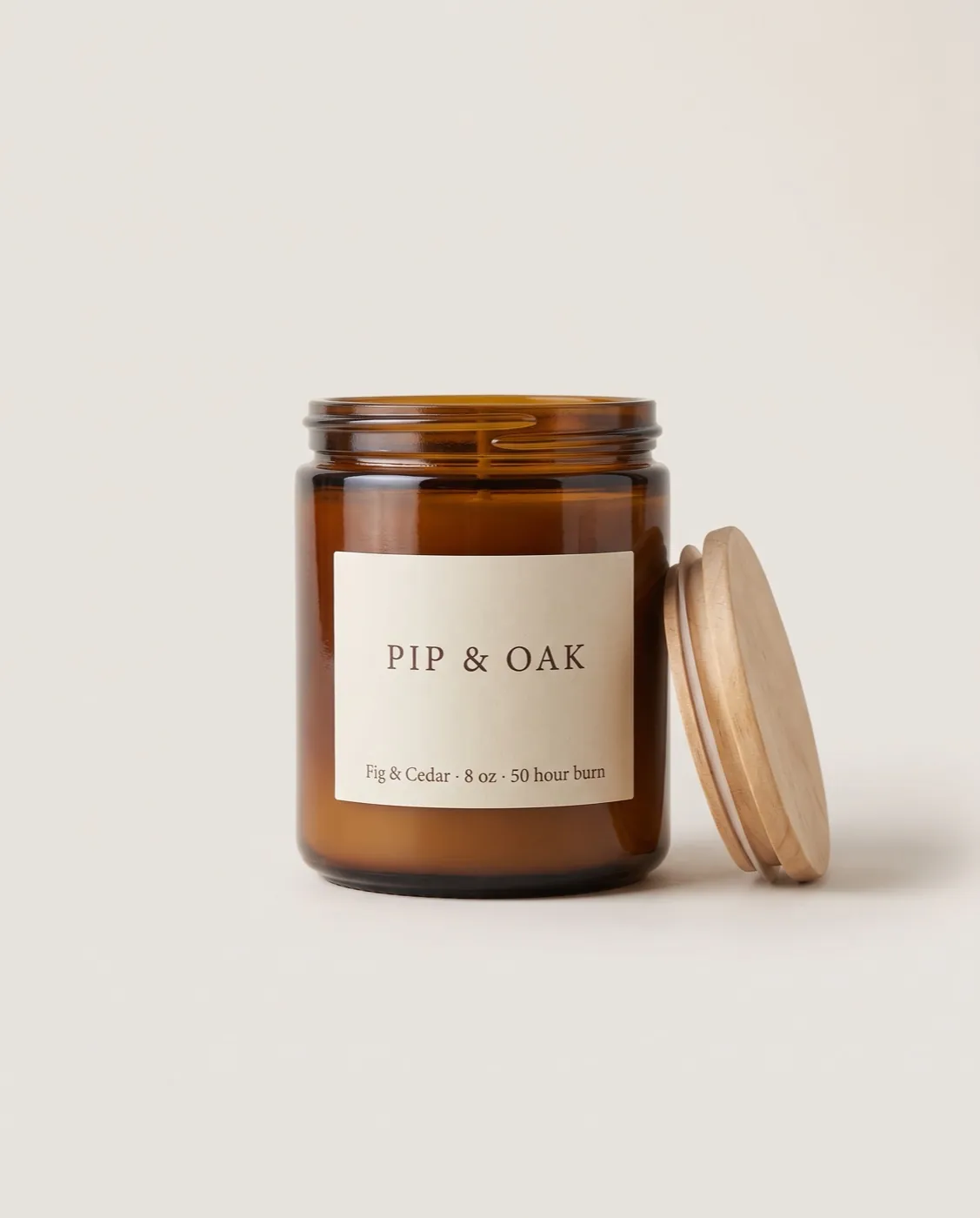
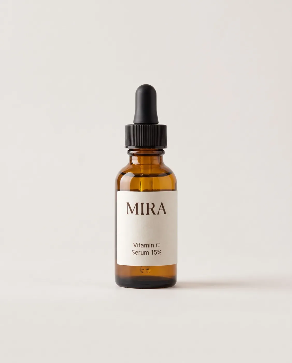
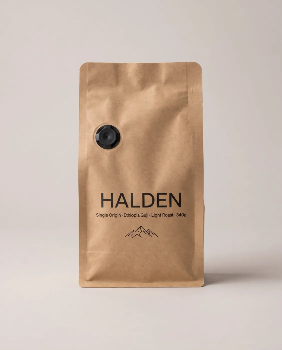
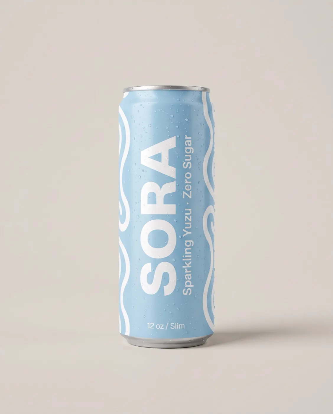
- A soft or low-resolution photo. The ad can only be as sharp as the packshot, so use your best one, ideally 2000 px or more.